Gail’s
Gail's — Selected Work
Info
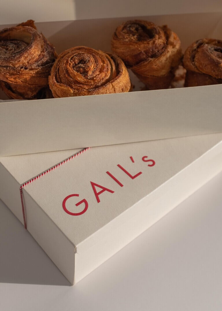
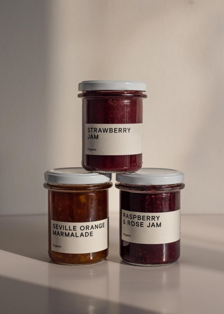
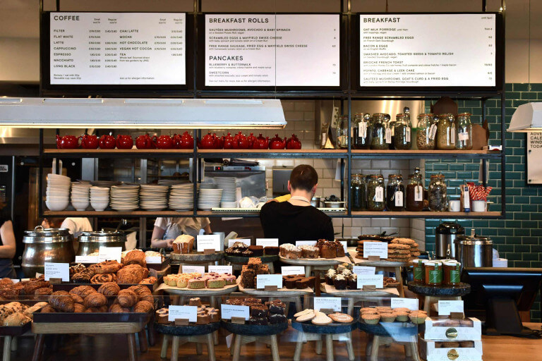
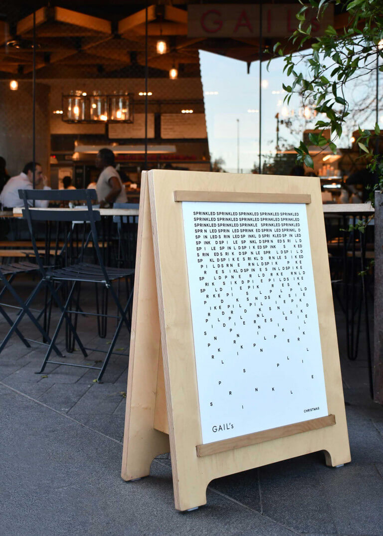
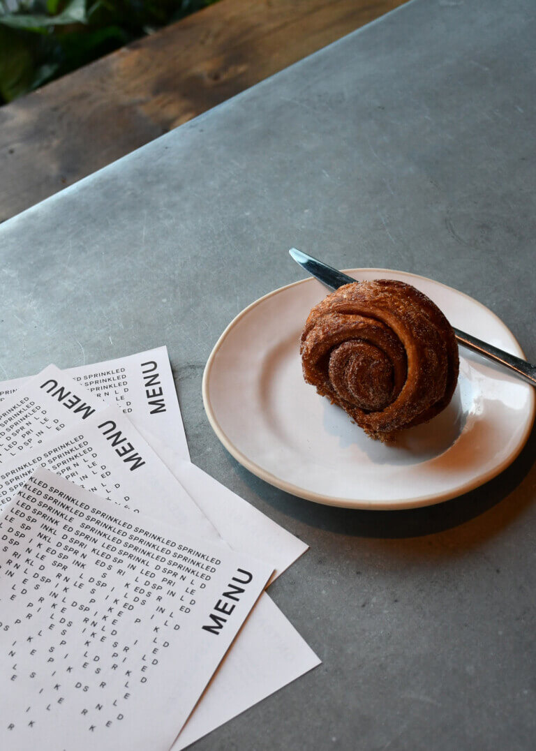
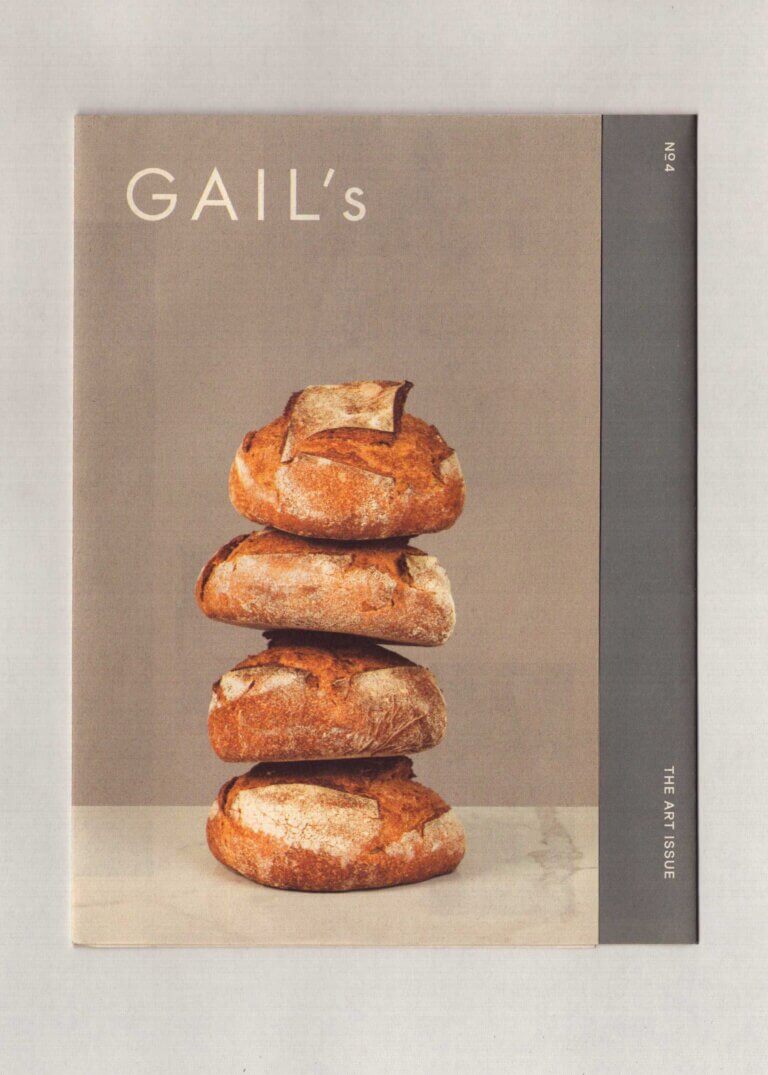
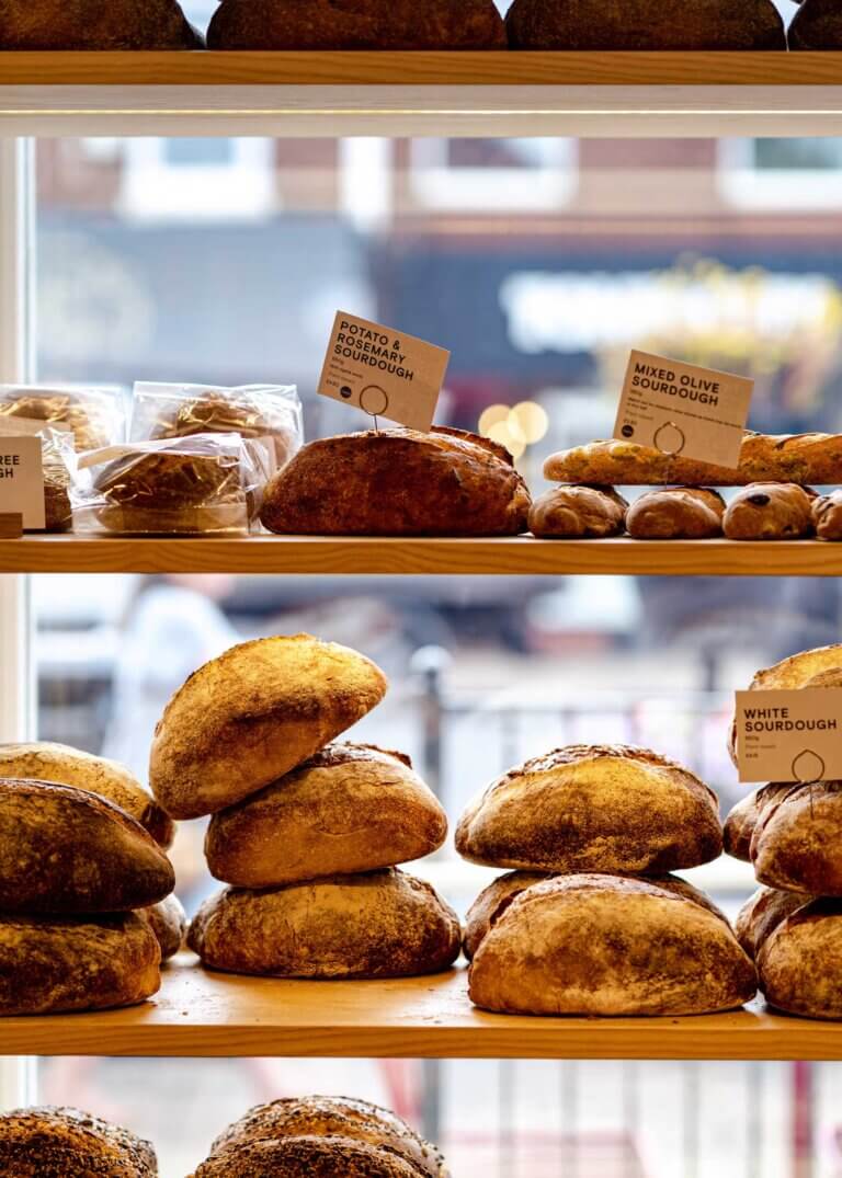
Gail’s opened their first bakery in 2005 based on the simple premise of elevating the ordinary; taking time to make good bread by hand using the best natural ingredients available. Following 14 years of growth, opening bakeries across different London neighbourhoods, they required a brand identity refresh to reflect how the business had evolved into a contemporary urban bakery and to give them an identity system they could develop and maintain in-house as they expanded outside of inner London.
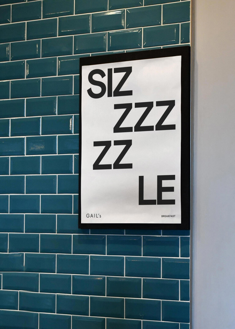
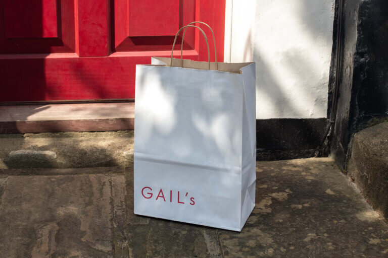
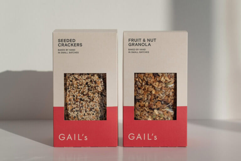
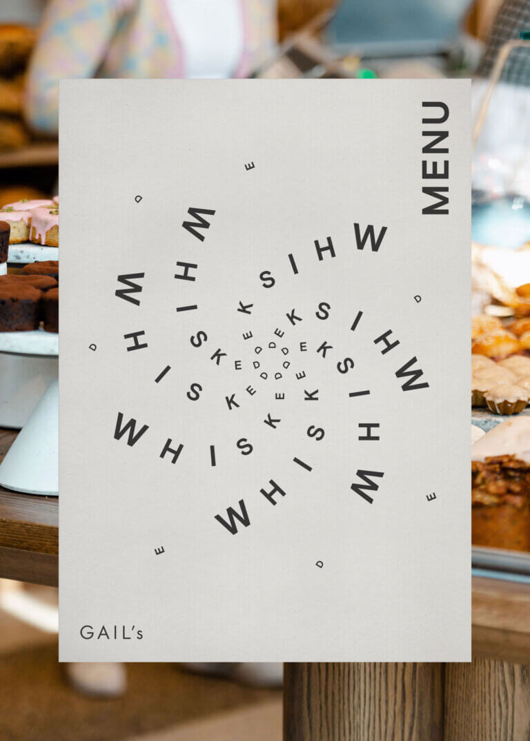
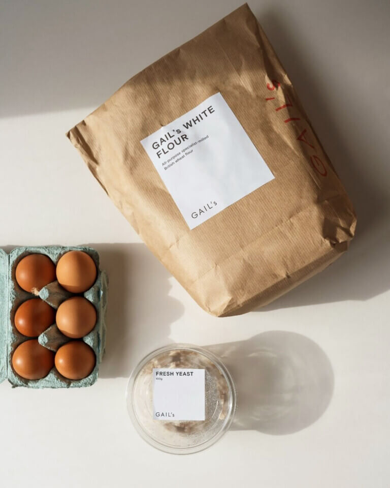
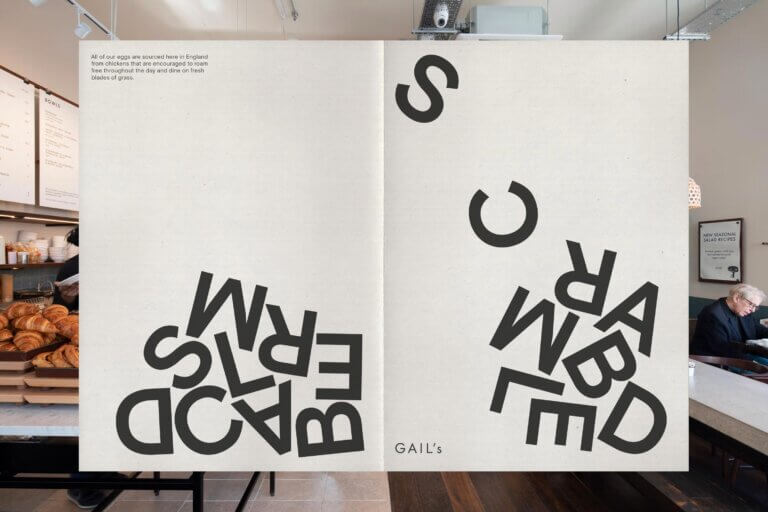
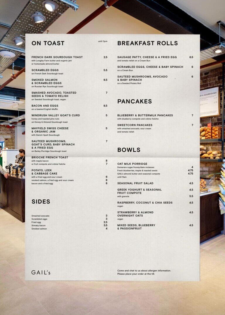
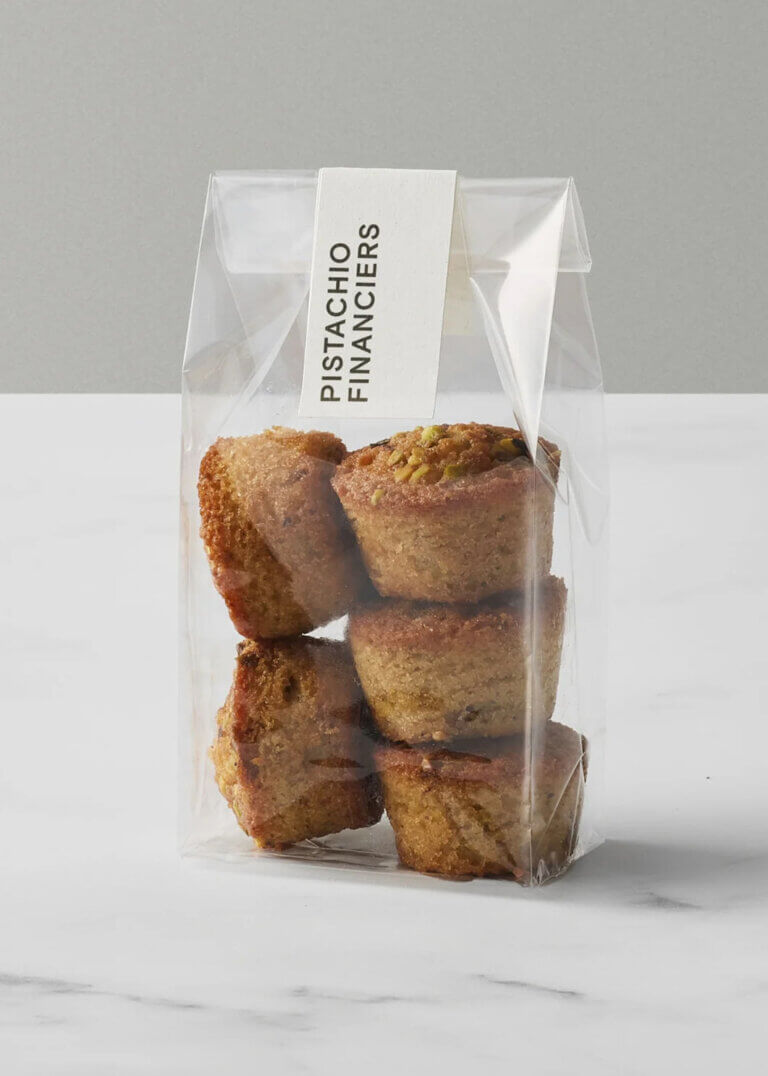
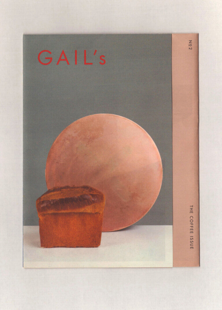
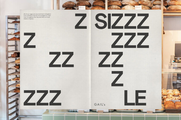
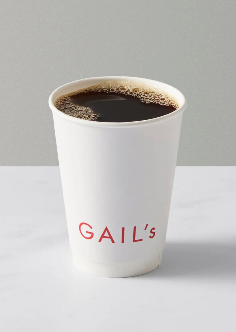
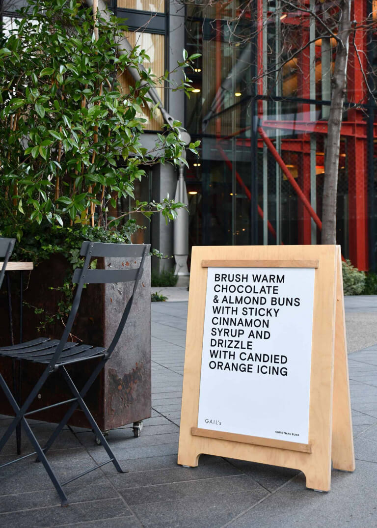
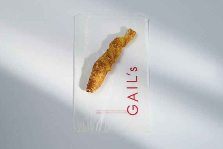
Working with the Gail’s team, we identified elements of the existing brand identity that should remain as constants and those which required updating. Reflecting their ethos of elevating the ordinary, our starting point was simplification, selecting a refined and functional sans serif font combined with the tactile materiality of sustainable packaging materials. To communicate their passion for food, we created a visual identity that celebrated the act of making and the ingredients through expressive language and typography.
Disciplines
Collaborators
- Camilla Wordie
- Emli Bendixon
- Nathalie Priem
- Lena Winkler